
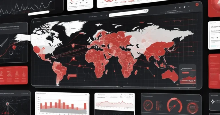
Reconciling data residency and unified dashboards: Highcharts + Amazon QuickSight
Business teams want a single view of carrier performance across the UK and the US. Regulators often insist raw telemetry stay inside national borders. That tension, one dashboard, many jurisdictions, is exactly where embedding Highcharts visuals into Amazon QuickSight can give teams the expressiveness they need while letting you design for data residency.
Why embed Highcharts into Amazon QuickSight?
QuickSight covers most BI needs, but some multi-dimensional visuals are missing or awkward to build natively. Examples where Highcharts adds value: true polygon radar overlays for multi-category profiling, hexagonal tilemaps for metro market-share, variwide bars that encode both share and volume, streamgraphs for winner flows, and packed-bubble clusterings for category scoring.
The practical pattern is to keep QuickSight as your control plane: authentication, sharing, governance, automation. Feed QuickSight field wells into reusable Highcharts JSON templates using placeholder tokens that QuickSight resolves at render time. That preserves a single operational surface while extending visual expressiveness.
Two architecture patterns (pick based on data sovereignty)
- Single-region SPICE dataset, Aggregate metrics into one region and host them in SPICE (QuickSight’s “Super-fast, Parallel, In-memory Calculation Engine”). Simpler to build and often faster at query time, but may conflict with regulatory or contractual obligations if raw or sensitive data must remain in-country. Note: SPICE capacity, per-region quotas and costs matter, size and cost estimates must be part of early scoping.
- Multi-region SPICE + Data Prep federation, Keep raw telemetry and regional analytics in-region (for example, eu-west-2 for the UK and us-east-1 / us-west-2 for the US). Publish aggregated metrics into regional SPICE datasets and use QuickSight’s Data Prep layer to federate those aggregates at query time into a single logical dataset. This lets you present a unified view without moving raw telemetry across borders, depending on how you and your legal team define “movement” and on your exact Data Prep setup, validate the approach with AWS documentation or support and your compliance team.
Dataset schema and representative sample values
Keep the schema compact so it’s easy to aggregate and federate. The example schema in the walkthrough contains:
- carrier
- category
- country
- rank
- rootscore
- product_period (e.g., “2024-2H”, “2025-1H”)
The walkthrough’s example covers seven carriers across two countries (UK, USA), seven performance categories (Call, Data, Overall, Reliability, Responsiveness, Text, Video), and two measurement periods: “2024-2H” and “2025-1H”. Example carrier IDs are Carrier1…Carrier7. Treat the numeric arrays below as sample/template values from that walkthrough. Use your authoritative telemetry for production.
- Avg Overall RootScore for 2024-2H (sample): [97.2, 95.66, 97.33, 93.97, 85.71, 82.56, 89.93]
- Avg Overall RootScore for 2025-1H (sample): [97.92, 96.53, 97.83, 94.65, 87.52, 85.06, 88.93]
- Tilemap market shares for 2025-1H (sample): Carrier3: 46.7%, Carrier1: 35.4%, Carrier4: 9.7%, Carrier2: 7.7%
- Streamgraph example series (sample counts across two periods): Carrier1: [80, 97], Carrier2: [25, 45], Carrier3: [138, 140] (other carriers present in the full template)
- Variwide example data for 2025-1H (sample):
- {“name”: “Call”, “y”: 42.3, “z”: 385}
- {“name”: “Data”, “y”: 23.8, “z”: 290}
- {“name”: “Overall”, “y”: 32.0, “z”: 303}
- {“name”: “Reliability”, “y”: 39.7, “z”: 307}
- {“name”: “Responsiveness”, “y”: 18.2, “z”: 319}
- {“name”: “SpCarrier4d”, “y”: 32.0, “z”: 387} (likely a stray placeholder)
- {“name”: “Text”, “y”: 33.5, “z”: 520}
- {“name”: “Video”, “y”: 25.9, “z”: 363}
- Target bubble config (sample per-carrier): {x: idx, y: 100, z: 15, name: carrier, gap2024: 100-AVG, gap2025: 100-AVG}
Which Highcharts visuals map to which business questions?
- Tilemap (hex grid where each tile ≈ 1% market): show regional dominance, ties, and market-share footprints.
- Polar / Radar (true polygon radar): compare carrier profiles across multiple categories (Call, Data, Reliability, etc.).
- Variwide (bar height = win share %, bar width = market volume): reveal where share matters most because markets differ in size.
- Streamgraph (flow over periods): surface momentum, who gained or lost #1 overall wins between periods.
- Packed bubble (clustered bubbles): group category scores by carrier; bubble size can encode avg RootScore or another magnitude metric.
- Column + bubbles overlay: combine ranked columns with scatter/bubbles for targets or thresholds.
How QuickSight and Highcharts exchange data
Templates use dynamic field-well bindings (QuickSight’s dataset-to-visual slots). Placeholder tokens like {{tilemap_series}}, {{radar_series}} or {{stream_series}} are resolved at render time so the same JSON adapts to different carriers, regions, or date slices.
Clarify the mechanics for your environment. Confirm whether placeholder resolution and JSON assembly happen server-side inside QuickSight before the payload reaches the embedded Highcharts library, or whether an embedding wrapper performs resolution client-side. That distinction affects security, payload size, and rendering latency.
Security, governance and operational cautions
The walkthrough’s authors report that QuickSight treats Highcharts configurations as structured data and “strips custom functions, event handlers, and formatter callbacks at the parameter layer” so user-supplied code is not executed. Treat this as a vendor/author claim. Verify the behavior with AWS support or your security contact and request written confirmation as part of your security review.
Practical controls to add to your checklist:
- Request written confirmation from AWS that custom-visual JSON is sanitized the way the authors describe, and include the sanitization test in your security acceptance criteria.
- Apply least-privilege IAM for datasets and ensure cross-region data access requires explicit roles/policies.
- Enable logging (CloudTrail, QuickSight audit logs) for dataset changes, SPICE refreshes, and dashboard publishes.
- Document aggregation formulas, provenance fields (region, aggregation method, timestamp) and a certified dataset process so consumers can trust federated metrics.
- Confirm Highcharts licensing with procurement, embedding Highcharts in commercial dashboards typically requires a commercial license.
“Warning: Deletion of Quick resources is permanent and can’t be undone. Confirm that you have backups of any analyses, dashboards, or datasets you want to retain before proceeding.”
Complementary QuickSight features to run the dashboards
Don’t let visuals be a static snapshot. QuickSight features you should consider:
- QuickSight Q, natural-language querying and conversational analytics; useful for non-technical stakeholders to ask questions like:
“What were the top performing carriers in last quarter?”
“Show me the trend of carrier performance across all regions.”
“Compare carrier performance between US and UK.”
- Spaces, organize, version and govern dashboards and datasets.
- Flows, automate SPICE refreshes, scheduled exports, alerts and downstream processes (for example, trigger a Flow when a carrier drops below a RootScore threshold).
30-60 day practical POC plan
- Define a tight pilot: two regions (eu-west-2 and us-east-1), three carriers, and two periods. Set success criteria up front (acceptable time-to-first-render, acceptable refresh latency, and a small UX test group).
- Implement regional ingestion and aggregation (S3 / RDS → regional analytics → regional SPICE datasets). Produce documented aggregated metrics and provenance fields.
- Create Highcharts JSON templates and map them to QuickSight field wells. Start with a tilemap and a radar chart to validate both spatial and multi-category needs.
- Validate QuickSight’s JSON sanitization with AWS support and include the test results in your security acceptance criteria. Confirm Highcharts licensing with procurement.
- Measure baselines: time-to-first-render, Data Prep join time, SPICE refresh time, and JSON payload size. Use those metrics to decide scale and refresh cadence.
- If POC passes governance and performance checks, expand visuals, automate alerts via Flows, and roll out to a larger user group.
Authoritative credits
The architecture patterns, JSON templates and example dataset discussed here are drawn from a walkthrough authored by Anupa Bhattacharyya (Enterprise Support Lead, AWS), Praney Mahajan (Enterprise Support Lead, AWS), and Vishnu Elangovan (Worldwide Agentic AI Solution Architect).
Key questions, and the concise, honest answers
- Can I present unified multi-Region dashboards without moving raw data across borders?
Yes, by keeping raw telemetry and analytics in-region, publishing aggregated metrics into regional SPICE datasets, and federating those aggregates with QuickSight’s Data Prep. Whether that satisfies your regulator depends on how “movement” and “aggregated” are defined in your legal context; document aggregation rules and validate with legal and AWS.
- Will QuickSight execute JavaScript functions embedded in Highcharts JSON?
The walkthrough’s authors report that QuickSight validates Highcharts JSON and strips custom functions, event handlers, and formatter callbacks so configurations are treated as structured data, not executable code. Treat this as a claim: verify with AWS support and include the sanitization test in your security checklist before production.
- Are the numeric examples (RootScores and market shares) production data?
No. The arrays and percentages cited are sample values from the walkthrough’s example dataset. Use your telemetry source for production metrics and document exact aggregation formulas.
- What are the main operational risks?
Key risks include SPICE capacity and refresh limits, rendering performance at high cardinality, licensing for Highcharts, and gaps in custom-visual sanitization. Mitigate by sizing SPICE, pre-aggregating data, testing visuals at target cardinality, confirming licenses, and validating sanitization with AWS.
- Should I roll this out enterprise-wide immediately?
No. Start with the POC, validate performance, security and licensing, and only expand once those gates are passed. That avoids compliance surprises and runaway costs.
Small but important housekeeping notes
- The variwide example contains a stray category labeled “SpCarrier4d”, remove or replace it before you copy templates into production.
- The streamgraph sample in the walkthrough shows only Carrier1, Carrier3 explicitly; ensure you populate all series for your full carrier set.
- Decide how you will encode ties, differing market definitions, and missing carriers across regions, and make those reconciliation rules part of the dataset provenance.
Embedding Highcharts into QuickSight is a practical extension that gives product and analytics teams the visual expressiveness they need, provided you treat it as an engineering and governance project, not just a UI tweak. Run a focused POC, document aggregation semantics, validate security and licensing with vendors, and measure UX and refresh KPIs before scaling.